Overview
Meal preparation is becoming quite common in young adults nowadays. As I also struggle with trying to plan out my meals for the week this project resonated with me. Currently, there are solutions out there in the market, such as food delivery services, meal kits, and meal tracking apps, but I wanted to seek out a way to improve the meal planning industry, that simplifies the meal planning process. I was responsible for the end-to-end design process of a meal prep app that not only caters to dietary needs, but also delivers the meals right to their doorstep.
Role
User Research
Usability Tester
UX/UI Designer
Tools
Figma
The Problem
Nowadays a lot of people are struggling with meal planning. The biggest issue seems to be time constraints, with meal planning requiring a good amount time and effort.
User Research
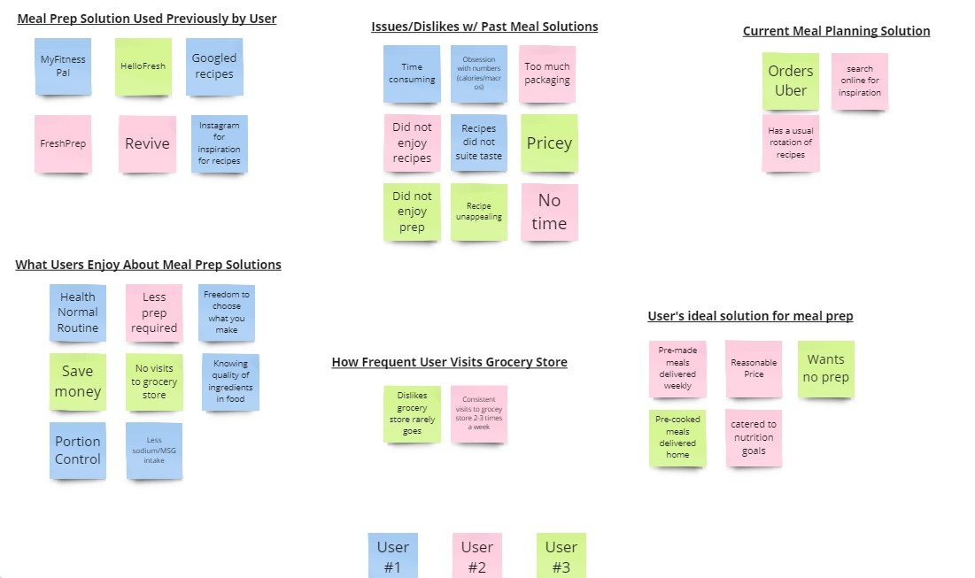
To understand why meal planning/prep is difficult, I decided to gather insights with users who are young adults. To better understand the problems individuals are facing I interviewed the users asking them to explain what their current routine is in planning their meals. After completing 3 in person interviews, some common patterns I noticed is that many users struggle with finding time to meal plan due to busy schedules. They also shared that the common solution to that would be to order food delivery, which puts a strain on their finances.
User Research Synthesis
Key Findings
Healthy meals are important to users
Users’ ideal solution is having pre-cooked meals delivered to them
Users find meal planning time consuming
Affinity Diagram
Having a few options available I used the A/B testing method on potential users to get their opinion on which layout they would prefer to interact with. I chose to go with the A/B user testing as I was under time constraints, and wanted quick feedback.
Brainstorming
Based on the user research, I began sketching out some screens that would be vital to the user interfacing with the app. Keeping in mind that I was trying to design this with the ideal user in mind.
Here are some how might we statements I refer back to during this process.
users make meal planning more efficient?
change the meal planning process to make it less time consuming?
create a solution that is budget friendly?

Solutions
A lot of time was put into the wire-framing, and mid to high fidelity mock-ups. I would get a lot of feedback from my mentor and potential users to see if they like a specific feature on the app.
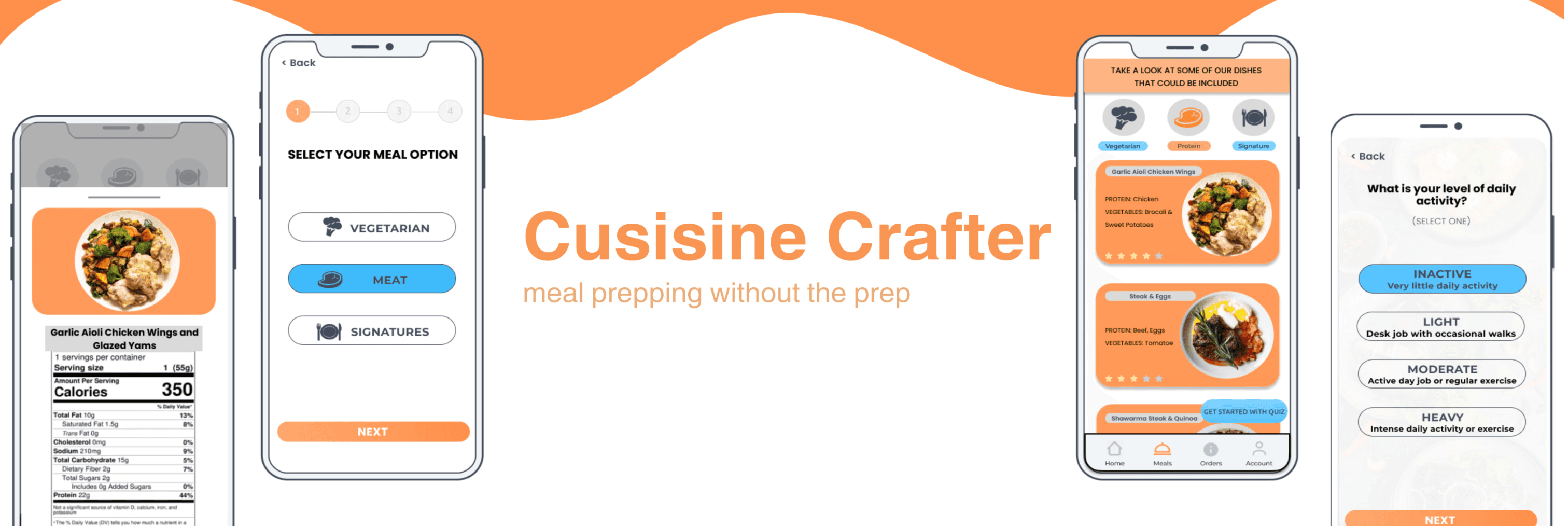
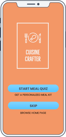
An example would be the onboarding quiz I implemented to help users find their ideal meal plan. This feature was created to combat the decision making process of what type of meals you want, the quiz will help inform you what the best option is.

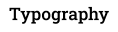
The design system was inspired by brand personality of hoping to convey specific attributes. The typography was inspired by many different designs that are on the market for food apps. I wanted to keep it familiar to what is currently out there to make the user comfortable.
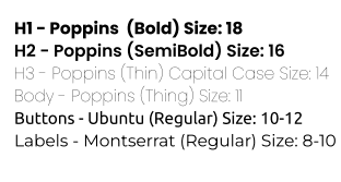

Design System
Usability Testing
A total of 8 moderated test users were done for the first and second round of user testing. During the first round of testing the users were asked to complete the task scenario which was to see if users were able to navigate through the app effectively, and here were the results.
Problem
The biggest issue that the majority of the participants faced was confusion with the purpose of the quiz. As there was no explanation on how the quiz is related to placing an order.
Solution
→ I included multiple blurbs near the “Start Meal Quiz” button and also created a banner to better explain the flow of the app
Problem
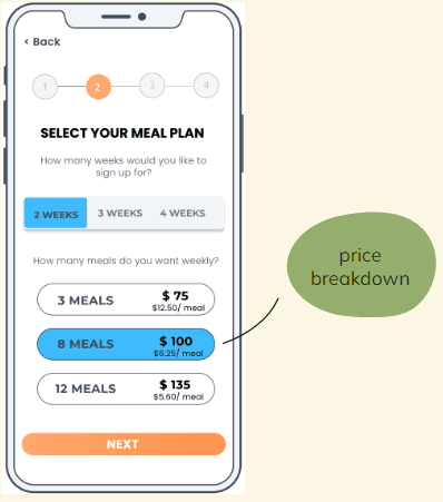
Another recurring issue that occurred was that during the ordering process a lot of users preferred having a price breakdown of the different plans.
Solution
→ I provided the breakdown of pricing during the meal ordering flow to make the process more seamless for users
Problem
A few users expressed that they would like an option to skip the quiz as they find it a bit long.
Solutions
→ Adding a skip feature to the quiz was a great idea and I implemented it by placing it on the landing page
Based on user feedback, I implemented changes after the first round of tests, and with the second round I was trying to see if any of the users had the same issues. This was a way to confirm that the changes were effective. I learned how to improve the app by looking at other mobile apps on the market for example, MyFitnessPal. the way they use the landing page to have the user sign up or sign in gave me to idea to do something similar. Overall, the user testing was insightful and the solutions that came out of the test created a better application.

Thank you for you time and for checking out my case study!
Final Thoughts
After completing this capstone project I realized there are quite a few solutions that are similar to mine, but I do believe that one feature that I have yet to see out there yet is an onboarding quiz.
If I had more time, I would have added a sleek and modern UI elements to cater to the younger demographic.